

Robots & Runes
A guide to Hugo and Nebula award-winning science fiction and fantasy, built for one course, restructured through IA testing in another, and still maintained.
- Client
- Graduate HCI coursework, now a personal project
- Role
- Designer and developer; IA research in a team of three
- Year
- 2026
- Disciplines
- Information architecture, User research, UI design, Front-end development
The problem
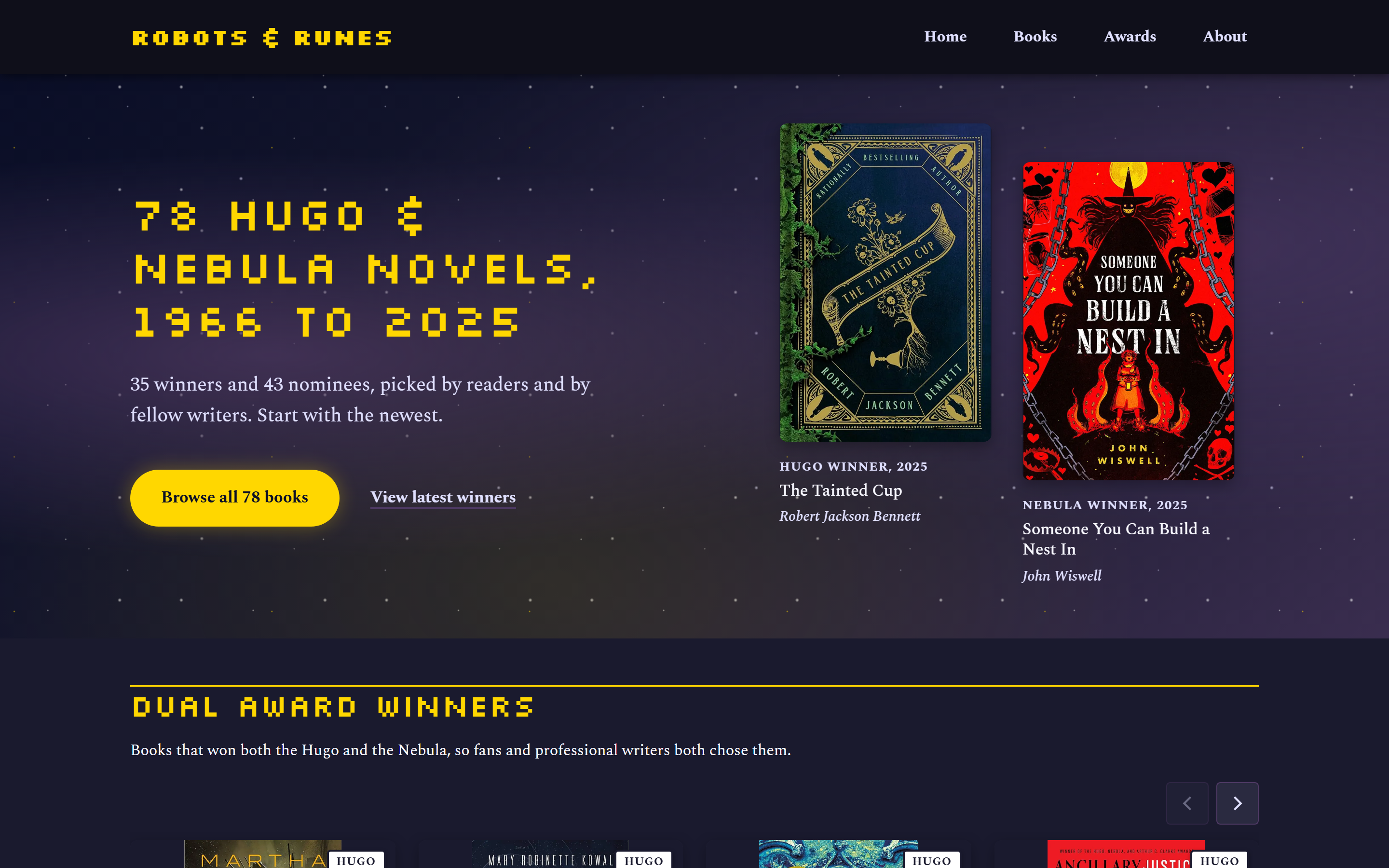
The Hugo and Nebula awards are the two best-known prizes in science fiction and fantasy, and their winner lists are a reliable way to find something good to read. The trouble is where those lists live. In a bookstore, on a phone, the usual reference is a set of long Wikipedia tables that were never meant to be read on a small screen.
Robots & Runes started as my project for a graduate HCI course in web design: a mobile-friendly guide to award-winning novels that you can pull up in the aisle. It now covers 78 novels from 1966 to 2025, 35 winners and 43 nominees, each with its awards, subgenres and themes, and a directory that filters on all of them.
A reading list you can use in the aisle.
A second course, a second look
The next year the site became the subject of a graduate course in information architecture and content strategy. I worked with Felicia Cueva and Thu Zaw to evaluate and restructure it. I wrote the proposal, drew the first site map draft and the personas, revised the card sorts and tree tests with the team, and gave the final presentation.
The brief was to improve how people discover books, understand the two awards, and move around the site. We worked in three stages, each feeding the next:
- Content inventory of every page and navigation path, to see what was there and where it overlapped.
- Card sorting over three rounds with 12 respondents, to learn how people group the site’s content on their own.
- Tree testing over three rounds with 16 respondents, to check whether people could find things in the revised structure.
What the inventory found
The site had grown by addition. A Buying Guide page offered its own filters over the same books as the Books directory, so there were two routes to the same task with slightly different results. Award information was meant to live on separate Hugo and Nebula pages, but the Hugo page was a stub and the Nebula page had never been built. And some labels described the site’s intentions rather than what you’d find: “Not Sure Where to Start?” was the heading for a recommendation quiz.
Seven categories down to four
The pilot card sort was scattered. Respondents produced seven categories and mixed navigation, content and external links together. Nobody could place “Not Sure Where to Start?”. Over the next two rounds we rewrote vague labels as plain, action-based ones, moved external links to the footer, and separated content (articles) from tools (filtering and the quiz). By the final round the categories had settled at four, and every respondent put all the awards content in one group.
That last result shaped the structure more than any other. People didn’t think of the Hugo and Nebula as two places to visit. They thought of “awards” as one subject.
Testing the tree
The tree tests asked people to complete four tasks using the site map alone: filter for a kind of book, find background on the Nebula Awards, find an article, and find out who made the site and why.
The filtering task failed in the pilot because people mistook the recommendation quiz for the filters. Better labels fixed most of that, but in round 2 some participants still looped between the quiz and the directory, and directness fell to 54.2%. The awards task, with Hugo and Nebula grouped under one heading, reached 100% in round 2. The samples were small, and we’d run moderated sessions next time to learn why people chose the paths they did, but the pattern was consistent across rounds.
The final site map put one filtering system at the centre. Every other route into the books, whether from an award page, a quiz result or a tag on a book, should land in that same directory with filters already applied.
Back to the code
The course ended with a site map and wireframes. Since then I’ve been working through it on the live site, alongside a broader accessibility and interface pass.
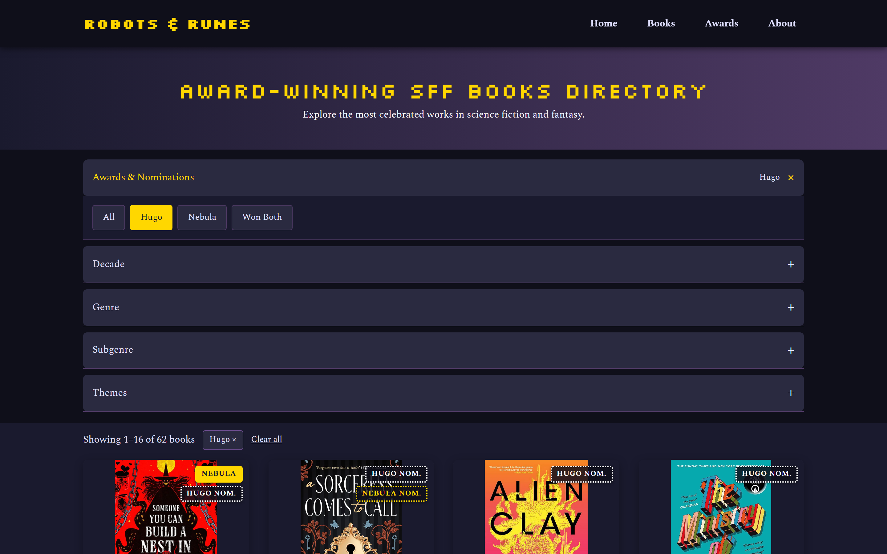
One filtering system. The Buying Guide is gone, and its old URL redirects permanently to the Books directory. Filter state now lives in the URL, so any page can link straight to a filtered view. The tags on each book page already worked this way. The directory shows the active filters as removable chips, says what each collapsed filter group has selected, and announces the result count as it changes.
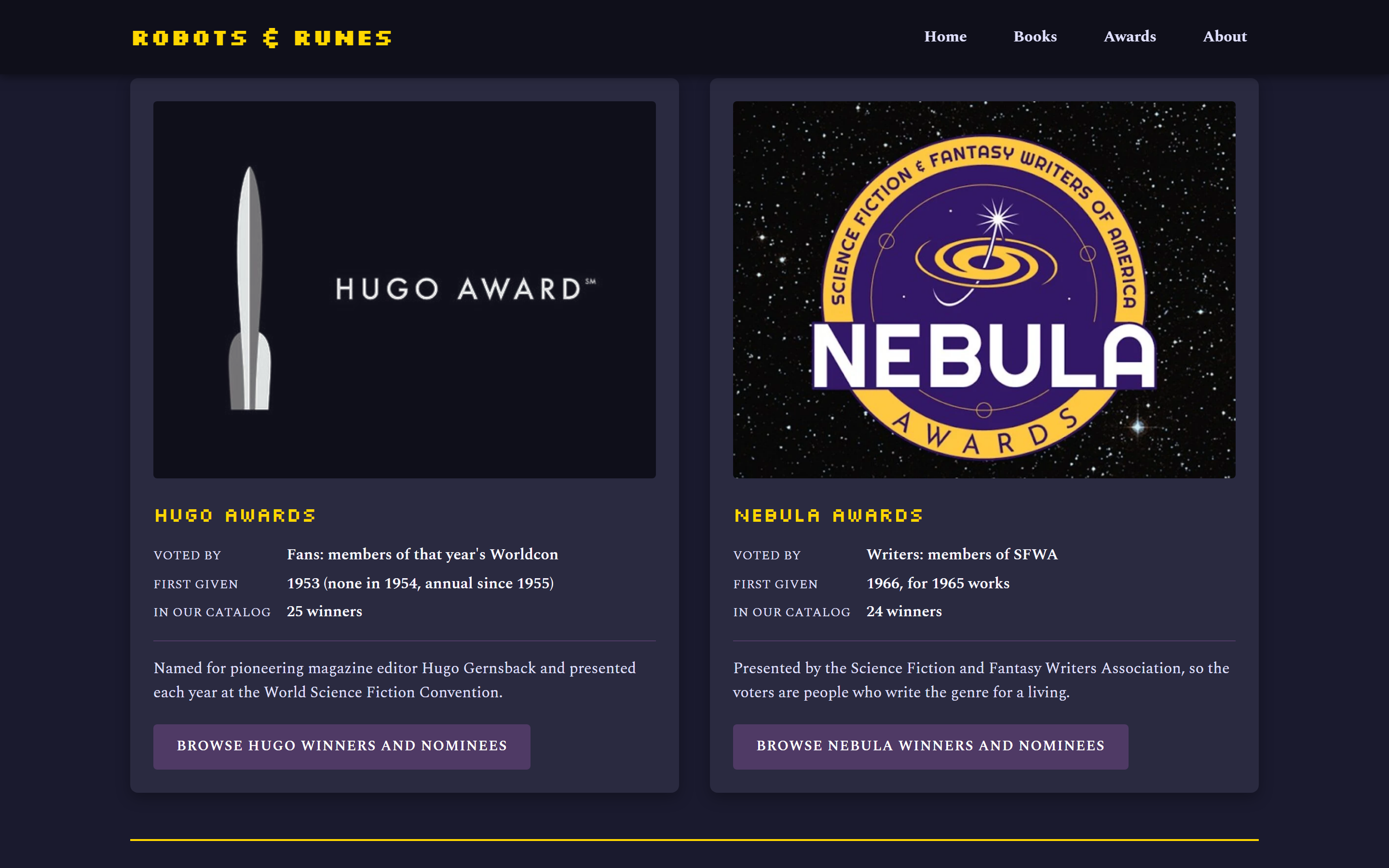
One awards page. The separate Hugo and Nebula pages are merged into a single Hugo vs. Nebula page, with one Awards item in the navigation and redirects from the old addresses. It answers the question the tree test asked: who votes on each award, when it started, and how many of its winners are in the catalogue. It also lists the 14 books that won both, which you can’t see from either award on its own. Each award’s button opens the directory pre-filtered rather than repeating a list of books.
Navigation. The main menu is now four items: Home, Books, Awards and About. That’s the card sort’s structure minus a blog that doesn’t exist yet. On mobile it’s a real button with its expanded state announced, and it closes on Escape.
Still open
Not every finding has reached the live site. The recommendation quiz still sits under the label testing flagged, “Not Sure Where to Start?”, and it still lives on the Books page beneath the filters, which is the arrangement people looped through in round 2. The next change is to give it its own page and a name that says what it does, so the quiz and the directory read as two different tools. The blog in the site map is still unwritten.
Reflection
Most of what testing changed was wording. A label that seemed friendly to us was unplaceable to every pilot respondent, and fixing the names moved the filtering task further than any structural change. The other lesson is about keeping a project after the course. The site map is only a plan until it’s in the code, and working through it piece by piece has made it clear which findings were about structure and which were about one confusing heading.